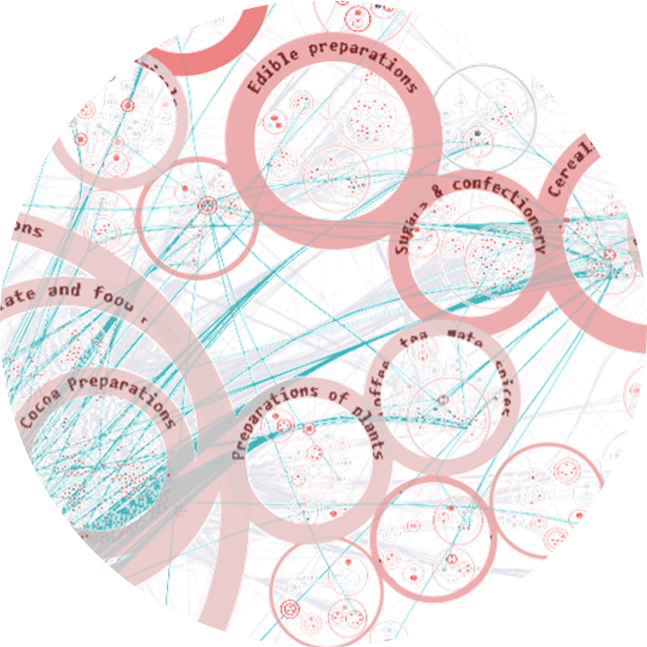

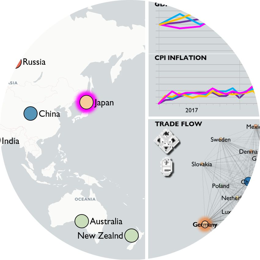
We present a human-in-the-loop (HITL) visual analytics approach that enhances systemic risk assessment through the domain-specific integration of hierarchical grouping, clustering, edge bundling, labeling, and zooming techniques. Our contribution is the deliberate combination of these methods to support perceptual scalability, enabling users to explore large, complex networks more effectively and reason about systemic vulnerabilities.
Field
Visualization Theory

2026
-
-
Uncharted contributed to the following chapter in Seeing Interaction Design:
Wacky Encodings for Humanities Visualization: Visualization conventions predispose researchers to see their data in terms of standard types. Getting beyond these conventions through graphical exploration offers a way to rethink data structures as well as analyses. We conducted a workshop based on a provocation to design alternative graphic tools that could produce unexpected outcomes compared to conventional visualizations.
-
This study examines data visualization design evolution over 12½ years, reflecting on the impact of Large Language Models over the last 3¾ years. Using a longitudinal corpus of 55 visualizations from a single-subject design record, the study identifies how LLMs have aided design-space exploration: reducing coding effort, enabling new design opportunities, shock, excitement, accomplishments, and shifts to the design process.
-
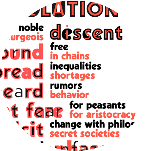
AI is transforming the design space of data visualization. This presentation discusses how the importance of text, narrative, and human context have long been overlooked. Building on prior work integrating text and visualization, it examines how large language models (LLMs) enable new approaches, from embedding text in visual structures to supporting interactive analysis of unstructured content. With AI influencing every stage of the visualization process, the boundaries of what constitutes a visualization are rapidly expanding.


2025
-
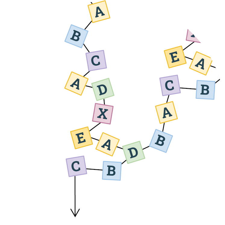
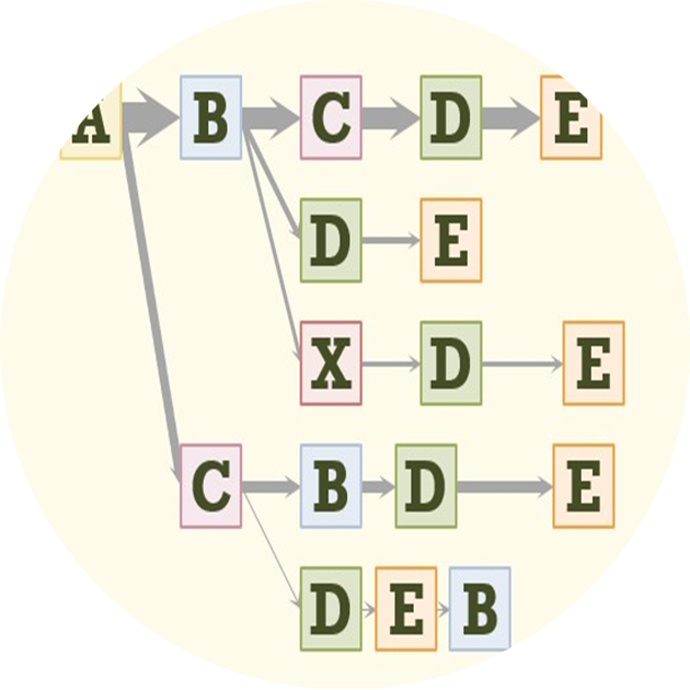
Journey analytics create sequences that can be understood with graph-oriented visual analytics. We have designed and implemented more than a dozen visual analytics on sequence data in production software over the last 20 years. We outline and demonstrate a variety of data challenges, user tasks, visualization layouts, node and edge representations, and interactions, including strengths and weaknesses of the various approaches. We also discuss how AI and LLMs can significantly improve these analyses.
2024
-
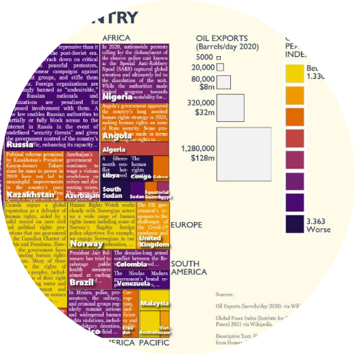
In an age of Large Language Models, online misinformation, plagiarism, hate speech, and more—the analysis of text is increasingly important. But traditional statistical visualization tools have lagged behind. Visualizing with Text characterizes the design-space for directly integrating text and visualization to reveal information disparity with examples such as text-centric scatterplots, line charts, treemaps, mindmaps and tables.
-
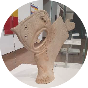
Data visualizations using natural forms have many precedents. This rich history can be revisited for inspiration—and to reflect critically on why natural forms get ignored in favor of charts, graphs, and plots.
-
Process mining and more broadly journey analytics create sequences that can be understood with graph-oriented visual analytics. We have designed and implemented more than a dozen visual analytics on sequence data in production software over the last 20 years. We outline a variety of data challenges, user tasks, visualization layouts, node and edge representations, and interactions, including strengths and weaknesses and potential future research.
2023
-
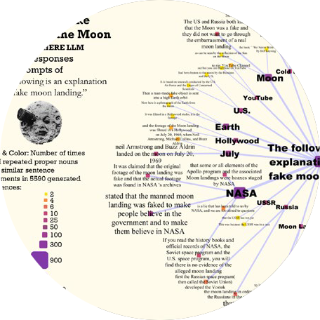
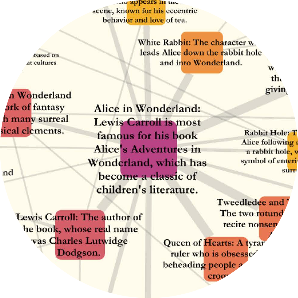
The breadth and depth of knowledge learned by Large Language Models (LLMs) can be assessed through repetitive prompting and visual analysis of commonality across the responses. We show levels of LLM verbatim completions of prompt text through aligned responses, mind-maps of knowledge across several areas in general topics, and an association graph of topics generated directly from recursive prompting of the LLM.
-
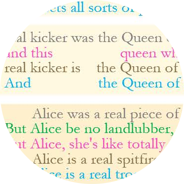
Text Style Transfer (TST) retains semantic content while modifying stylistic features. Exploratory visualization of LLM-generated TST via semantically aligned text visualization reveals advanced stylistic techniques such as use of metaphors. LLM style inquiry can be used to articulate advanced stylistic devices such as interjections, idioms and rhetorical devices and visually depicted as multivariate style heatmaps.
-
For effective visualizations, there are many types of design to consider. Visualization design focuses on core theory of tasks, data and visual encodings. Workflow design, user interface design and graphic design all contribute to successful visualizations. All design aspects range from initial design exploration to iterative design refinement. Guidelines can help, but have limitations.
2022
-
Qualitative data can be conveyed with strings of text. Fitting longer text into visualizations requires a) space to place the text inside the visualization; and b) appropriate text to fit the space available. To fit text within these layouts is a function for emerging NLP capabilities such as summarization.
-
Gaps and requirements for multi-modal interfaces for humanities can be explored by observing the configuration of real-world environments and the tasks of visitors within them compared to digital environments. Some of these capabilities exist, but not routinely available in implementations.
-
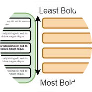
Text is one of the most commonly used ways to transmit information. It is widely used in various visualizations and determines our understanding of the presented content. The information density of text can be enhanced by visualizing data in typographic attributes, such as font weight, letter spacing, or oblique angle. To increase information density the furthest, without the visualization losing performance or effectiveness, the perceivable granularity of the typographic attributes needs to be known.
-
Visual Analytics of Hierarchical and Network Timeseries Models
Dual Y Axes Charts Defended: Case Studies, Domain Analysis and a Method
VisIRML: Visualization with an Interactive Information Retrieval and Machine Learning Classifier
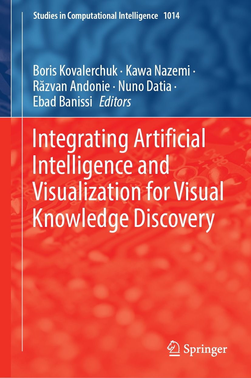
Uncharted contributed the following chapters to Integrating Artificial Intelligence and Visualization for Visual Knowledge Discovery:
Visual Analytics of Hierarchical and Network Timeseries Models: Visual analytics that represent many aspects of timeseries models in one holistic application are perceptually scalable to exploration of millions of nodes.
Dual Y Axes Charts Defended: Case Studies, Domain Analysis and a Method: We show dual axes charts are necessary for fine-grained correlation analysis that is not made obvious within single axis charts or other means.
VisIRML: Visualization with an Interactive Information Retrieval and Machine Learning Classifier: VisIRML, a system to classify and display unstructured data, produces higher quality labels than semi-supervised learning techniques.
-
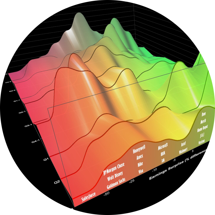
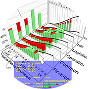
3D charts are not common in financial services. We review chart use in practice. We create 3D financial visualizations starting with 2D charts used extensively in financial services, then extend into the third dimension with timeseries data. We embed the 2D view into the 3D scene; constrain interaction and add depth cues to facilitate comprehension. Usage and extensions indicate success.
2021
-
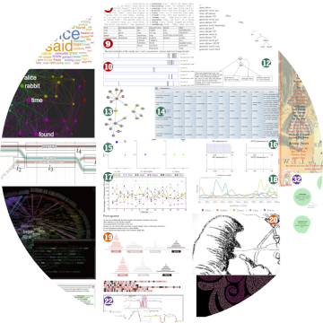
There are still many potential literature visualizations to be discovered. By focusing on a single text, the author surveys many existing visualizations across domains, in the wild, and creates new visualizations. Many dozen techniques are indicated, suggesting a wider variety of potential visualizations beyond research disciplines.
-
Quantitative data, such as a 10k financial report, requires cognitive load to scan the columns and rows and identify patterns and important takeaways, whether novice or subject matter expert. Visualizations can be used to summarize and reveal patterns. However, it may still be difficult to understand what is most meaningful. What should the viewer pay attention to? In this research, we reduce the cognitive load in understanding tabular data by combining charts with ranked natural language generated (NLG) bullet point statements that summarize the top takeaways.

2020
-
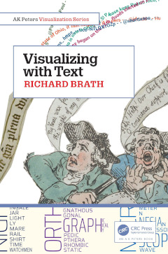
Visualizing with Text uncovers the rich palette of text elements usable in visualizations from simple labels through to documents. Using a multidisciplinary research effort spanning across fields including visualization, typography, and cartography, it builds a solid foundation for the design space of text in visualization.
-
Digital humanities are rooted in text analysis. However, most visualization paradigms use only categoric, ordered or quantitative data. Literal text must be considered a base data type to encode into visualizations. Literal text offers functional, perceptual, cognitive, semantic and operational benefits. These are briefly illustrated with a subset of sample visualizations focused on semantic word sequences, indicating benefits over standard graphs, maps, treemaps, bar charts and narrative layouts.
-
Visualization has recently gained a foothold in the field of artificial intelligence research. Typically, this work has focused on visualizing modules or specific dynamics of machine learning models, doing so for the purposes of model explainability or for visual debugging. Drawing from ongoing projects involving pandemic analysis and famine shocks, this seminar describes research efforts on graphical modeling where visualization functions as the medium for modeling itself.
-
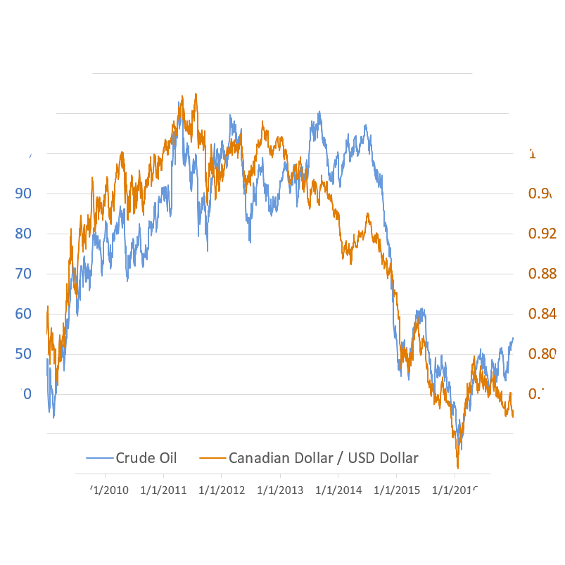
Many researchers and authors recommend against dual-axis charts. We provide a case study of timeseries correlation analysis in financial services where dual-axis charts superimpose series to facilitate observation of local patterns. Fine-grain patterns cannot be otherwise perceived using single-axis charts, normalization charts, scatterplots nor statistical correlation analysis.
-
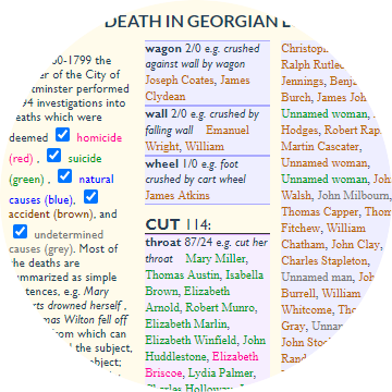
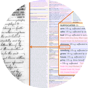
More data is text than quantitative. Beyond the current standard visualization techniques, so much more is feasible looking across domains and history. Designers, computer scientists and analysts of texts need an expanded visualization vocabulary. This talk illustrates the breadth of design possibilities for using text with visualizations. First, the design space is defined by a review of historic exemplars. Then, using this new design space, text and typography are used to create new kinds of visualization techniques.

2019
-
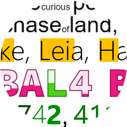
SparkWords are consistently sized words embedded in prose, lists or tables; enhanced with additional data including (a) categoric, ordered or quantitative data; (b) encoded by a variety of attributes (singular or multiple); and (c) applied to words or letters. Historic examples and sample implementations show a range of novel techniques and different uses.
2018
-
Typographic variables were only briefly discussed by Bertin with no example applications. We extend Bertin’s framework with literal encoding, ten typographic attributes, variations on scope including characters, words, phrases and paragraphs, and more layout types. We apply the framework to Bertin’s population dataset to create eleven new typographic visualizations. New research opportunities include readability, semantic association, interaction, and comprehension.
-
Annotations on typical charts, graphs and maps draw a viewer’s attention to a particular subset of an otherwise information-dense display thereby aiding understanding. Instead of manual creation of annotations, we outline approaches to automatically generate annotations.
-
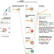
Causality is important for providing explanations when using computational models to understand complex systems structure and behavior, and what happens when change occurs in the system. There are many properties of causality that need to be considered and made visible, but current causality visualization methods are limited in expressions, scale, dimensionality and do not provide sufficient support for user tasks such as “what-if” and “how-to” questions, or in supporting groups considering multiple scenarios.
2017
-
Text analytics have significantly advanced with techniques such as entity extraction and characterization, topic and opinion analysis, and sentiment and emotion extraction. But the visualization of text has advanced much more slowly. Recent visualization techniques for text, however, are providing new capabilities. In this talk we offer an overview of these new ways to organize massive volumes of text, characterize subjects, score synopses, and skim through a lot of documents. Together, these techniques can improve workflows for users focused on documents.
-
Timeseries line charts are a popular visualization technique but traditionally do not show many lines. We borrow concepts of tiny microtext and path dependent cartographic text to embed labels and additional text directly into lines on line charts, thereby making it easier to identify individual lines in a congested line chart, enabling more lines to be displayed and enabling additional data to be added to the lines as well.
-
Stem and leaf plots are data dense visualizations that organize large amounts of micro-level numeric data to form larger macro-level visual distributions. These plots can be extended with font attributes and different token lengths for new applications such as n-grams analysis, character attributes, set analysis and text repetition.
-
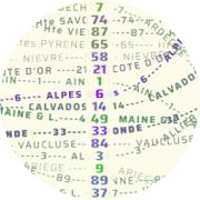
The rich history of cartography and typography indicates that typographic attributes, such as bold, italic and size, can be used to represent data in labels on thematic maps. These typographic attributes are itemized and characterized for encoding literal, categorical and quantitative data. Label-based thematic maps are shown, including examples that scale to multiple data attributes and a large number of entities.
2016
-
In this position paper, we extend design critiques as a form of evaluation to visualization, specifically focusing on unique qualities of critiques that are different than other types of evaluation by inspection, such as heuristic evaluation, models, reviews or written criticism. Critiques can be used to address a broader scope and context of issues than other inspection techniques; and utilize bi-direction dialogue with multiple critics, including non-visualization critics.
-
We show that many different set visualization techniques can be extended with the addition of labeled elements using font attributes. Elements labeled with font attributes can: uniquely identify elements; encode membership in ten sets; use size to indicate proportions among set relations; can scale to thousands on clearly labeled elements; and use intuitive mappings to facilitate decoding.
-
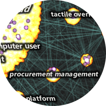
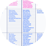
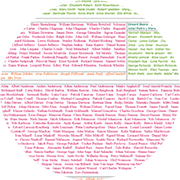
This article is a systematic exploration and expansion of the data visualization design space focusing on the role of text. A critical analysis of text usage in data visualizations reveals gaps in existing frameworks and practice. A cross-disciplinary review including the fields of typography, cartography, and coding interfaces yields various typographic techniques to encode data into text, and provides scope for an expanded design space.
2015
-
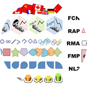
Encoding a high number of categories in a glyph may be necessary and can be encoded as label, icon, shape or texture. Number of categories, transparency, layout, compound glyph and legibility are considerations for the encoding.
2014
-
3D information visualization has existed for more than 100 years. 3D offers intrinsic attributes such as an extra dimension for encoding position and length, meshes and surfaces; lighting and separation. Further 3D can aid mental models for configuration of data within a 3D spatial framework. Perceived issues with 3D are solvable and successful, specialized information visualizations can be built.
-
There are many different types of shape attributes that can be used to encode data for information visualizations. Prior art from many fields and experiments suggest that there are more than a half dozen different attributes of shape that can potentially be utilized to effectively represent categoric and quantitative data values.
-
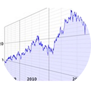
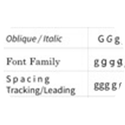
Font specific attributes, such as bold, italic and case can be used in knowledge mapping and information retrieval to encode additional data in texts, lists and labels to increase data density of visualizations; encode data quantitative data into search lists; and facilitate text skimming and refinement by visually promoting of words of interest.
2013
-
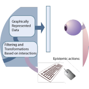
In this paper we introduce Visual Thinking Design Patterns (VTDPs) as part of a methodology for producing cognitively efficient designs. We describe their main components, including epistemic actions (actions to seek knowledge) and visual queries (pattern searches that provide a whole or partial solution to a problem). We summarize the set of 20 VTDPs we have identified so far and show how they can be used in a design methodology.
2012
-
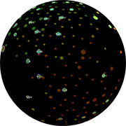
Use of a sphere as a basis for organizing an information visualization should balance issues such as occlusion against potential useful benefits such as natural navigational affordances and perceptual connotations of an application.
-
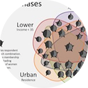
Representing quantities on Venn and Euler diagrams can be achieved through the use of multi-attribute glyphs. These glyphs can also act as an aid to assist in the visual decoding of the membership of segments within the diagrams and convey other data attributes as well.
2011
-
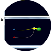
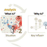
In this paper we report on our preliminary designs for Animated Attention Redirection Codes (AARCs), these are interactive short animated streaks traveling from a moused over symbol that convey information linkages in a transitory manner.
2010
-
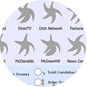
Multiple shape attributes can be used within information visualizations. Prior art from many fields and experiments inform what the attributes of shape are and the potential ways that we may effectively utilize shapes to represent multiple data values within an information visualization.
2009
-
Adaptive user interfaces offer the potential to improve the learnability of software tools and analytic methodologies by tailoring the operation and experience to a user’s needs. Scaffolding is an instructional strategy that can be applied by adaptive interfaces to achieve this. Scaffolding theory suggests that the level of guidance should be adjusted to optimize learning and performance levels. This paper explores the use of adaptive techniques to scaffold user interaction and presents a taxonomy of techniques for adaptive scaffolds within complex software systems. The techniques identified in the proposed taxonomy can help software scaffolds select appropriate adaptations in response to the user’s learning and operating needs. A scaffold called nAble was implemented to explore the application of adaptive techniques from the taxonomy to support an analysis methodology called the Analysis of Competing Hypotheses (ACH).
-
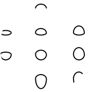
This is the opening keynote lecture from the 13th International Conference on Information Visualisation. Shape is an under-explored visual attribute in information visualization. Although usually listed on visual attribute tables as a single entry (shape), there are many sub-attributes of shape that can be independently encoded and combined such as curvature, angle, terminators, etc. Many examples illustrate the encodings of multivariate data into glyphs with utilizing multiple shape attributes.
2008
-
Alternative visualization designs provide different solutions that may be more effective for various tasks. Methods such as mechanical, symbolic and natural analogies aid ideation of alternative information visualizations. Issues include metaphor entrapment and implementation effectiveness.
2005
-
When creating a visualization for communication, the inclusion of aesthetically appealing elements can greatly increase a design’s appeal, intuitiveness and memorability. Used without care, this “sizzle” can reduce the effectiveness of the visualization by obscuring the intended message. Maintaining a focus on key design principles and an understanding of the target audience can result in an effective visualization for communication. This paper describes these principles and shows their use in creating effective designs.
-
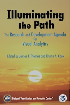
Development of the visual analytics agenda began after a survey of leading universities’ researchers found that traditional views of the needed sciences, such as visualization, did not address the required capabilities. We needed to achieve a broad understanding of the requirements in order to enable the best talents to address the technical challenges. Achieving this understanding required training from those dealing with border protection, emergency response, and analysis. It also required the assembly of a dedicated team of highly motivated people to develop this agenda.

2004
-
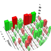
Effective design is crucial for dashboards. A good information design will clearly communicate key information to users and makes supporting information easily accessible.
2003
-
Paper landscape refers to both an iterative design process and a document as an aid to the design and development process for creating new information visualizations. A paper landscape engages all stakeholders early in the process of creating new visualizations and is used to solicit input; clarify ideas, features, requirements, tasks; and obtain support for the proposal, whether group consensus, market validation or project funding.
1997
-
Information visualization permits users to interactively explore large amounts of data. Poorly designed information visualizations will not reveal insight. Effective visualizations will. Guidelines will aid developers to make effective visualizations. These guidelines serve as a starting point for designing visualizations and as a starting point for further research.