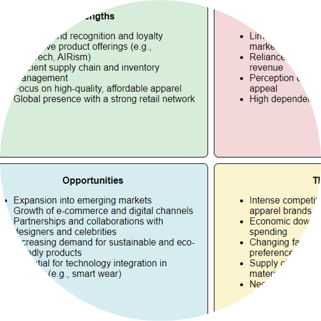
Strategy management analyses are created by business consultants with common analysis frameworks (i.e. comparative analyses) and associated diagrams. We show these can be largely constructed using LLMs, starting with the extraction of insights from data, organization of those insights according to a strategy management framework, and then depiction in the typical strategy management diagram for that framework (static textual visualizations).
Field
Finance

2024
2023
-
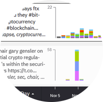
Expert technical analysts are always looking for new techniques to better understand supply, demand, and market prices. In this presentation, we examine the potential of alternative datasets, advanced AI and novel visualizations to reveal market movements.
2022
-
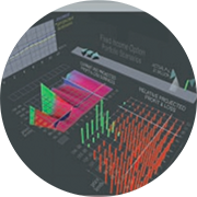
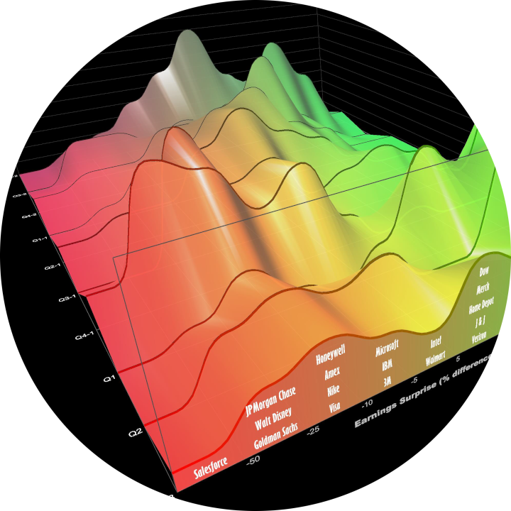
3D charts are not common in financial services. We review chart use in practice. We create 3D financial visualizations starting with 2D charts used extensively in financial services, then extend into the third dimension with timeseries data. We embed the 2D view into the 3D scene; constrain interaction and add depth cues to facilitate comprehension. Usage and extensions indicate success.
2021
-
Quantitative data, such as a 10k financial report, requires cognitive load to scan the columns and rows and identify patterns and important takeaways, whether novice or subject matter expert. Visualizations can be used to summarize and reveal patterns. However, it may still be difficult to understand what is most meaningful. What should the viewer pay attention to? In this research, we reduce the cognitive load in understanding tabular data by combining charts with ranked natural language generated (NLG) bullet point statements that summarize the top takeaways.

2020
-
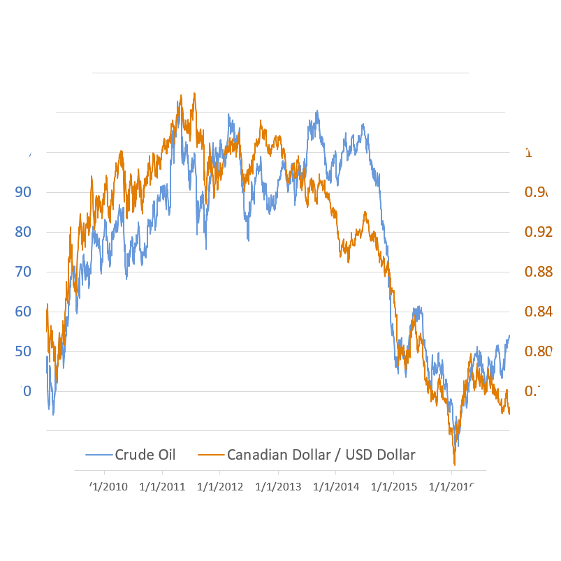
Many researchers and authors recommend against dual-axis charts. We provide a case study of timeseries correlation analysis in financial services where dual-axis charts superimpose series to facilitate observation of local patterns. Fine-grain patterns cannot be otherwise perceived using single-axis charts, normalization charts, scatterplots nor statistical correlation analysis.
2019
-
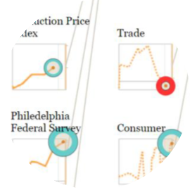
Timeseries models are used extensively in financial services, for example, to quantify risk and predict economics. However, analysts also need to comprehend the structure and behavior of these models to better understand and explain results. We present a methodology, derived from extensive industry experience, to aid explanation through integrated interactive visualizations that reveal model structure and behavior of constituent timeseries factors, thereby increasing understanding of the model, the domain and the sensitivities. Expert feedback indicates alignment with mental models.
2015
-
Analysts and data scientists work with large amounts of data, but the common approach, which dates back 20 years, is to roll up all the data into summary tables or charts, resulting in loss of detail. In contrast, direct visual exploratory analysis of massive amounts of raw data can yield insights that are otherwise overlooked. Here we highlight high-density visualizations that directly plot hundreds of millions of data points for applications such as market opportunity, periodicity analysis, and anomaly identification.
-
This session demonstrates using open source tools and techniques for visually exploring massive node-link graphs in a web browser by visualizing all the data. Seeing all the data reveals informative patterns and provides important context to understanding insights. Examples will highlight large-scale graph analysis of social networks, customer purchase history, and healthcare industry data.


2014
-
Financial visualization has existed for more than 100 years. Ongoing growth of financial markets increases the frequency, complexity and scale of data while users need to discern meaningful insights for many different types of tasks and objectives. This panel brings together four established practitioners from the financial industry who use visualization tools every day.
-
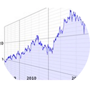
3D information visualization has existed for more than 100 years. 3D offers intrinsic attributes such as an extra dimension for encoding position and length, meshes and surfaces; lighting and separation. Further 3D can aid mental models for configuration of data within a 3D spatial framework. Perceived issues with 3D are solvable and successful, specialized information visualizations can be built.
-
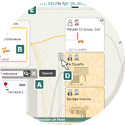
In this paper, we present in-progress work on “Influent,” a graph analysis tool that enables an intelligence analyst to visually and interactively “follow the money” or other transaction flow. Summary visualizations of transactional patterns and entity characteristics, a left-to-right semantic flow layout, interactive link expansion and hierarchical entity clustering enable Influent to operate effectively at scale with millions of entities and hundreds of millions of transactions, with larger data sets in progress.

2013
-
Visual aggregation techniques, tools and easily tailorable components are needed that will support answering analytical questions with data description, characterization and interaction without loss of information. We present two case studies of prototype implementations of JavaScript browser-based visualization tools leveraging the Louvain clustering algorithm.
-
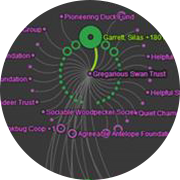
Big graphs are difficult to visualize because the scale of the data quickly results in complex network diagrams that can be difficult to decipher and have complicated interfaces with hundreds of options. Instead, we start by understanding what valuable nuggets we are trying to learn from this data, such as “Who’s connected to both me and my competition?” and “Did these people meet?” Starting from the question, we can then simplify the requirements and design effective visualizations that fit the problem. We will look at some mini-case studies and demos (e.g. Twitter correlation network, charity network).
-
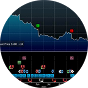
Bloomberg has designed and implemented a scalable visual representation for the depiction of many discrete timestamped events in use by hundreds of thousands of financial markets experts. This visualization enables a single screen to visually organize a large volume of event data; to facilitate inference through visual alignment of related data; and to provide a workflow from the single point of access to a wide variety of detailed information.
2012
-
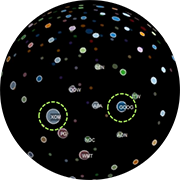
Use of a sphere as a basis for organizing an information visualization should balance issues such as occlusion against potential useful benefits such as natural navigational affordances and perceptual connotations of an application.

2009
-
The Cognitive Playground: Fostering Critical and Creative Thinking with Synthetic Worlds
Synthetic Worlds and Financial Services
Uncharted contributed the following chapters to Working Through Synthetic Worlds:
The Cognitive Playground: Fostering Critical and Creative Thinking with Synthetic Worlds: This chapter explores the potential of synthetic worlds to help individuals learn and practice higher order thinking skills including critical and creative thinking. Such skills are difficult to teach in traditional educational settings and are rarely addressed in common simulation-based training programs.
Synthetic Worlds and Financial Services: Collaborative interactions and transactions among traders, portfolio managers and risk managers can be transformed with synthetic worlds. It is easy to anticipate that by 2025, the reports, analyses and projections from financial industry participants will exist in a shared workspace for dissemination and collaboration that is flexible, adaptable and with high visualization capabilities

2007
-
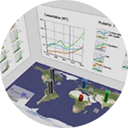
We will demonstrate an interactive visualization prototype with capabilities for ad hoc exploration that we have not found in other tools for policy analysis outside of the intelligence community. This visual workspace is built on a dynamic butterfly economic model. It enables analysts to examine for policy purposes global trends in consumption, production, imports and exports at national and regional scales and to relate them to population, GDP and income elasticity.
2006
-
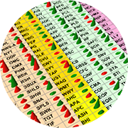
Visualizing spreadsheet content provides analytic insight and visual validation of large amounts of spreadsheet data. Oculus Excel Visualizer is a point and click data visualization experiment which directly visualizes Excel data and re-uses the layout and formatting already present in the spreadsheet.
2005
-
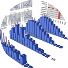
Microsoft Excel has evolved beyond a simple data calculation tool to the point where it is now used as a sophisticated and flexible repository for collecting, analyzing and summarizing data from multiple sources. The power of Excel can be leveraged with visualization in many different ways: enhancing effectiveness, focusing communications, helping make anomalies pop out, facilitating comprehension and empowering collaboration.
-
When creating a visualization for communication, the inclusion of aesthetically appealing elements can greatly increase a design’s appeal, intuitiveness and memorability. Used without care, this “sizzle” can reduce the effectiveness of the visualization by obscuring the intended message. Maintaining a focus on key design principles and an understanding of the target audience can result in an effective visualization for communication. This paper describes these principles and shows their use in creating effective designs.
-
The opportunities for competitively harnessing information visualization to drive strategic business advantage are much bigger today than 10 years ago. Choose your visualization solutions carefully; fit is extremely important, and with visualization, a poor fit will show!

2004
-
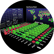
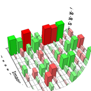
Effective design is crucial for dashboards. A good information design will clearly communicate key information to users and makes supporting information easily accessible.
2003
-
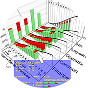
Paper landscape refers to both an iterative design process and a document as an aid to the design and development process for creating new information visualizations. A paper landscape engages all stakeholders early in the process of creating new visualizations and is used to solicit input; clarify ideas, features, requirements, tasks; and obtain support for the proposal, whether group consensus, market validation or project funding.
2000
1999
-
This groundbreaking book defines the emerging field of information visualization and offers the first-ever collection of the classic papers of the discipline, with introductions and analytical discussions of each topic and paper. The authors’ intention is to present papers that focus on the use of visualization to discover relationships, using interactive graphics to amplify thought.

1998
-
The value of information visualization depends on the success of its applications. One important application area is business visualization. To discuss issues and to share experiences and lessons learned in business visualization (bizviz), my colleagues and I in the visualization community conducted a birds-of-a-feather session on business visualization at the IEEE Information Visualization 97 Symposium with 44 spirited attendees. This short note highlights the discussions.

1997
-
Information visualization methods present multi-dimensional data graphically by mapping data and properties to different visual shapes, colors, and positions. The purpose of visualization is to improve comprehension and reveal significance. It is easier to comprehend a visual representation than a numerical one, especially when the visual representation replaces many pages or screens of data.
-
From IEEE Computer Graphics and Applications, July issue