Visualization
Blog
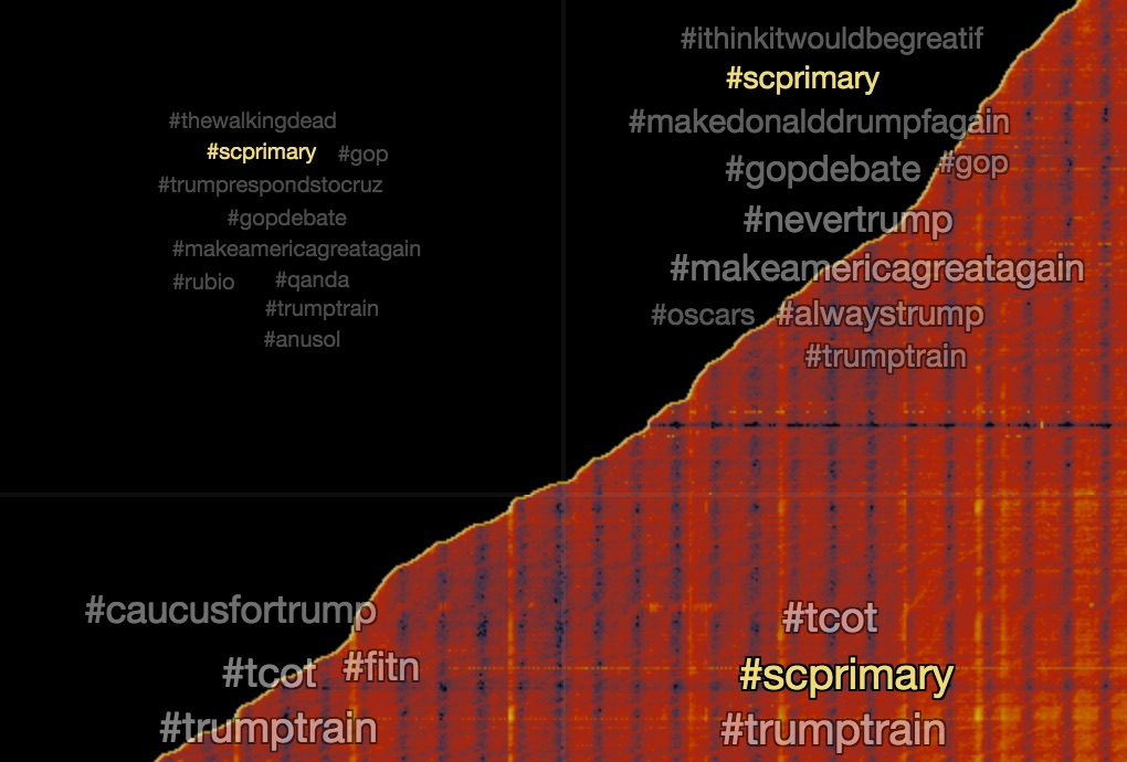
In our ongoing analysis of tweets about Donald Trump we pulled together 27 million tweets in the month of February from 3.7 million unique users. It seems like everyone is joining the conversation in different ways.
Last summer we began tracking tweets that mention Donald Trump in preparation for our talk at Strata NY. At the time it looked like things were only going to get more interesting so we kept watching and, as of Feb 1, we’d processed over 59 million tweets. With the Iowa caucus last week it seemed like a good time to revisit some of our earlier analysis.
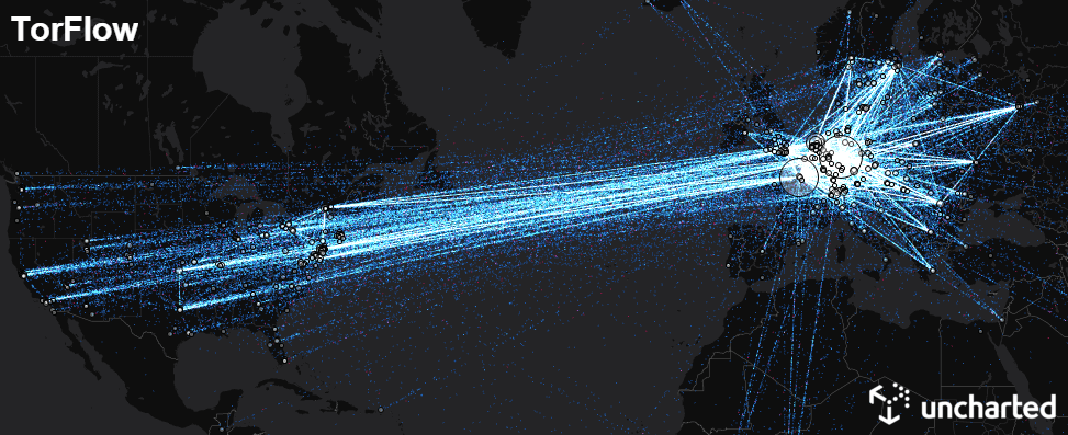
The Tor project is an open network for anonymous communication over the internet. Tor routes users' internet traffic through a series of volunteer-run relay nodes to conceal its origin and destination from potential surveillance or censorship. While Tor is built for anonymity, the structure of the network and locations of many of the relay nodes is open.
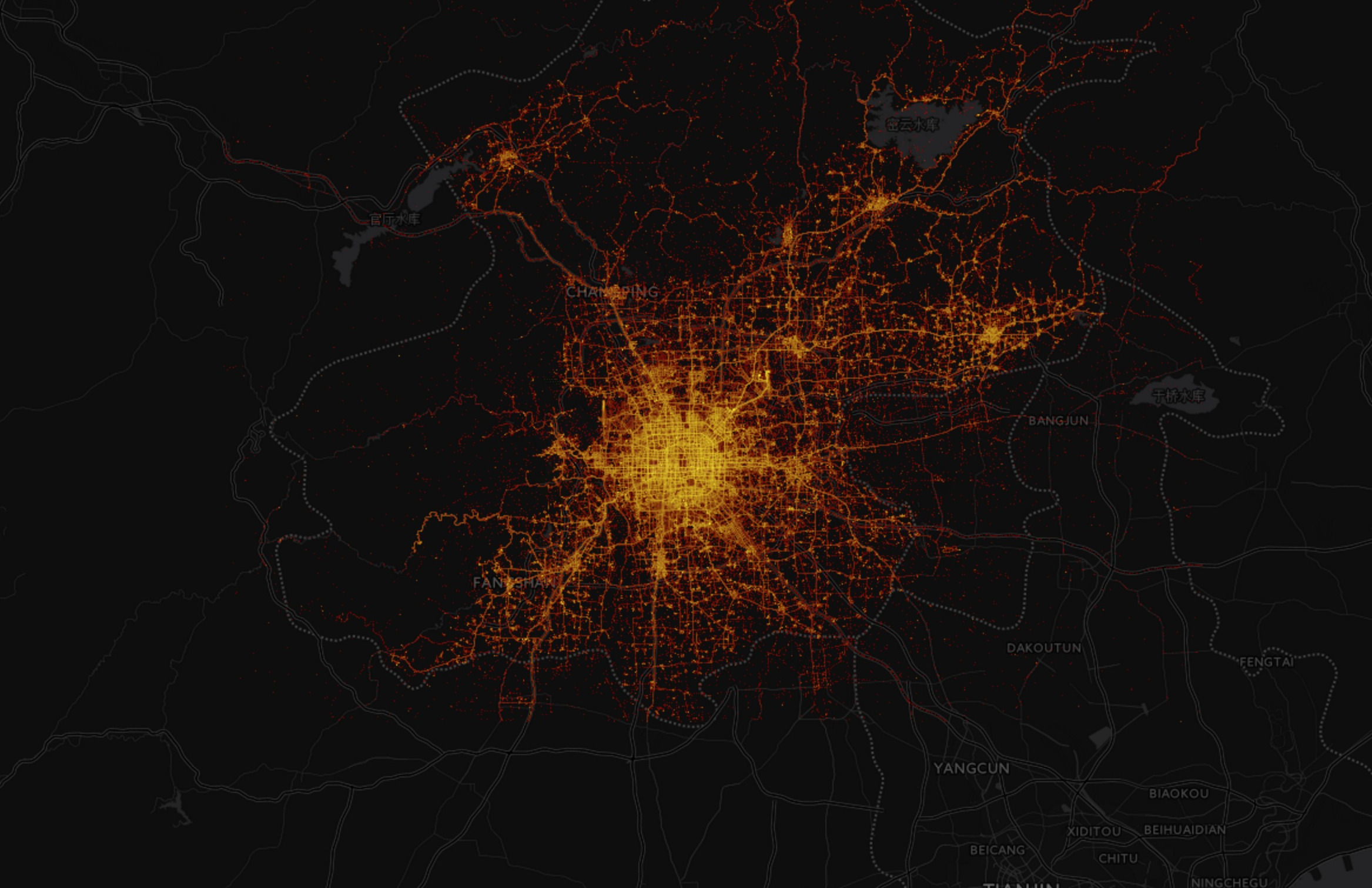
One of the questions we’ve spent a lot of time pondering over the years is a deceptively simple one - How do we visualize billions of data points? To understand why this is a difficult question to answer, let’s look at two popular approaches.