Last summer we began tracking tweets that mention Donald Trump in preparation for our talk at Strata NY. At the time it looked like things were only going to get more interesting so we kept watching and, as of Feb 1, we’d processed over 59 million tweets. With the Iowa caucus last week it seemed like a good time to revisit some of our earlier analysis. We’ll focus specifically on the 48 hours spanning the caucuses, from 7 PM EST on Sunday Jan 31 to 7 PM EST on Tuesday Feb 2.
From a high level
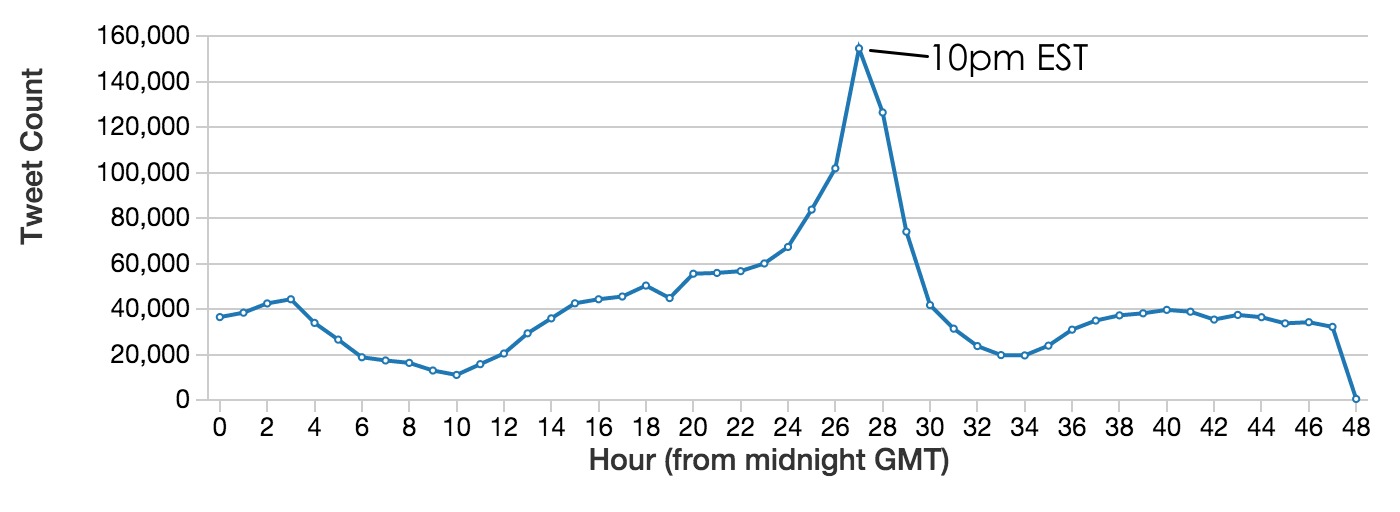
First, some basics. We’re using the Twitter public streaming API to capture tweets that mention the key words “Trump” (covers “DonaldTrump,” “Trump4President,” etc), “WakeUpAmerica,” and “MakeAmericaGreatAgain.” In the 161 days of collection prior to February we observed an average of 374,778 tweets per day. Over In the 48 hours spanning the Iowa caucus we observed 2,052,099 tweets from 701,814 unique Twitter accounts. The number of tweets captured per hour during this time shows a significant spike on Feb 1 around 10 PM EST as results are announced.
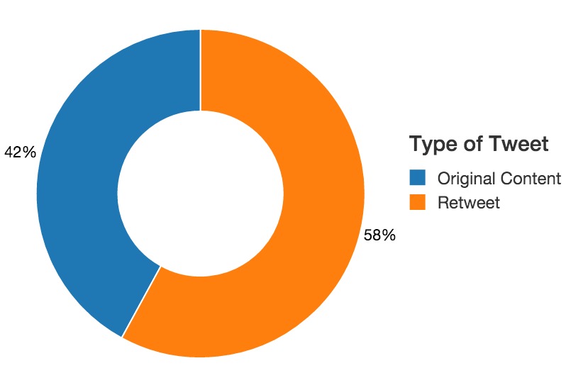
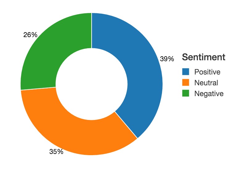
Slightly more than half of the 2 million tweets are retweets, and a sentiment analysis using a lexicon tuned for social media shows a slight trend towards the use of positive terms.
Looking at the users
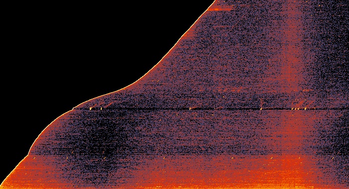
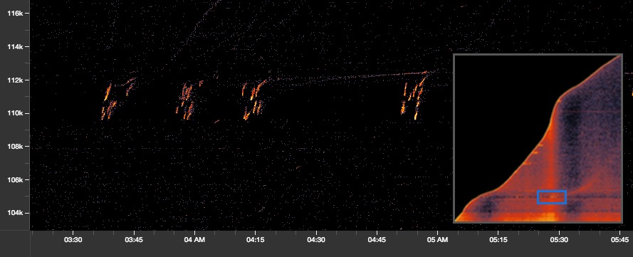
But what really interested us was looking at patterns in the engagement behavior of those 700,000 users. We started by rank-ordering each account that tweeted during this time period by the time of their first tweet. With this value we used Salt (our open source Spark library for scalable data visualization) to plot a heatmap of all 2M tweets in a user-rank vs time space. The result is a plot that looks somewhat like the up-slope of a mountain plot where “hotter” colors indicate more tweets at that time/user-rank region.
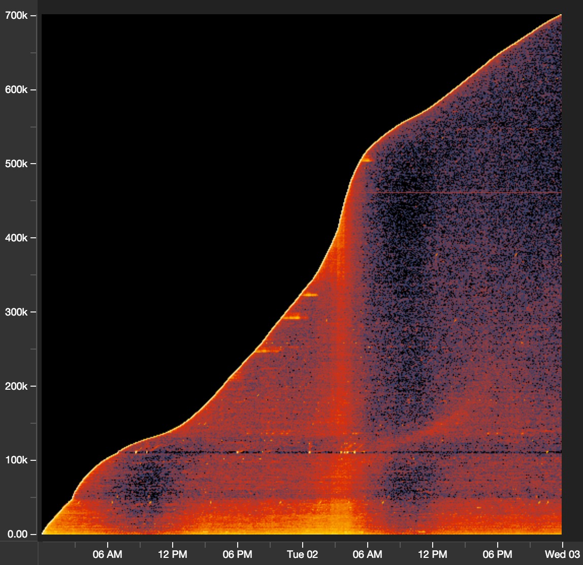
Y-axis is user account rank, X-axis is time in GMT (+5 hours from EST)
The mountain plot shows us a number of characteristics of the collected data in a single view. Most obvious is the temporal distribution of the data, most notably the band of higher activity levels in the middle of the image, around 10 PM EST (3 AM GMT). The slope of the …slope of the mountain is proportional to the rate of new user engagement - that is, the cumulative total number of observed user accounts participating in the conversation by time. The new engagement rate remains consistent throughout the day on Feb 1 but has a dramatic increase just before official results are announced and continues until people start going to bed.
Bots
There are a few notable hot-spots in this plot worth exploring. The first is around three areas of intense activity, shown in detail below.
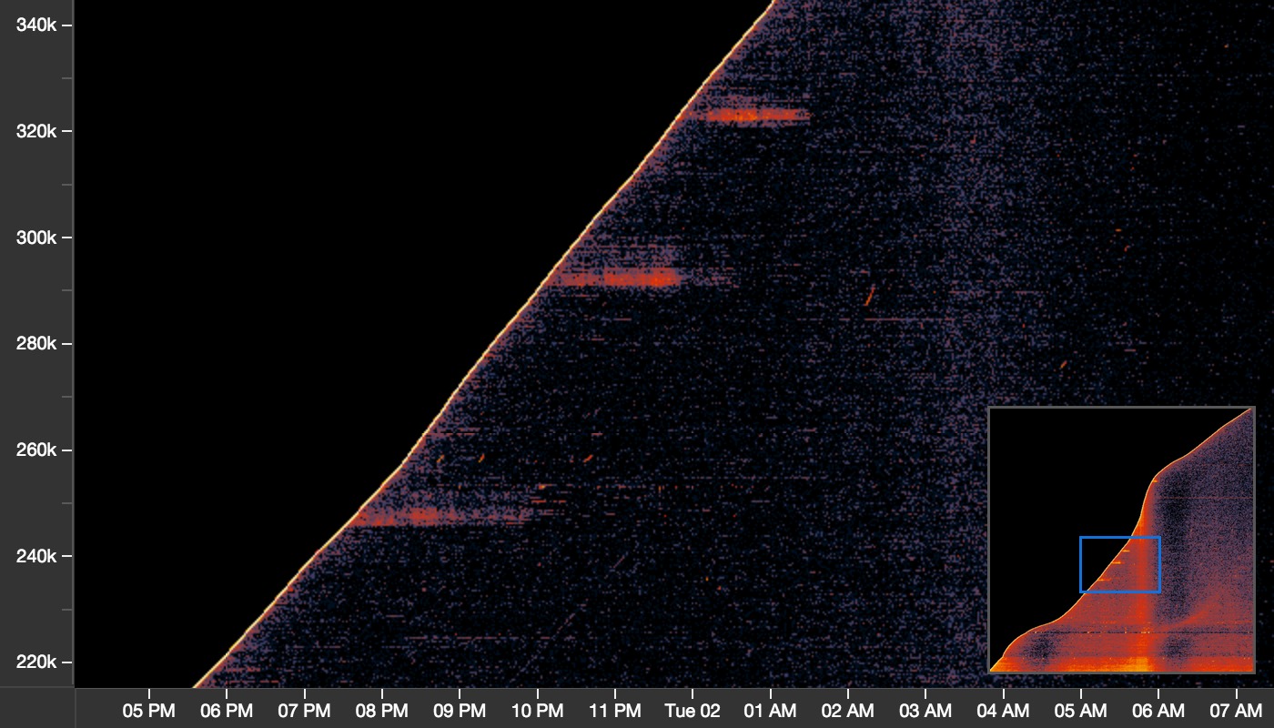
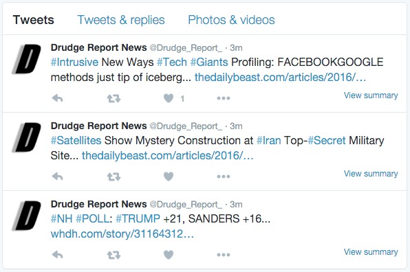
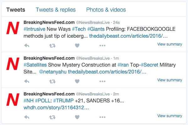
Lasting between one and two hours in length, these bursts of activity are interesting because they are limited to a narrow band of users - a small subset of accounts tweeting about Donald Trump with relative coordination. Examining these tweets further shows that more than half of the tweets in these regions are retweets of either @NewsBreaksLive or @Drudge_Report_ (note the small username difference, it is not @Drudge_Report). Further examination of these accounts shows they both tweet the same content at a rate of about one tweet per minute.
A random sampling of the user accounts seen retweeting these two bots in these bursts shows account names like exur_uxunaroy, onab_anuluw18, and eyuf_ozenon28 which, at the time of writing this, have all been suspended by Twitter. Moreover, all of the suspended accounts that we checked retweeted both @Drudge_Report_ and @NewsBreaksLive.
June Bots
Another interesting pattern in the data appears as a horizontal stripe just above the 100k user mark. Zooming in quite closely to the 10 PM time period we see the following striking pattern:
Over the course of 1.5 hours, four bursts of activity occur involving more than 2,000 Twitter accounts that appear as sharp upwards traces as content propagates through the network. Drilling into these tweets further shows that 99% are retweets of either @PoliticsJim or @VIralBuzzNewss. Furthermore, the accounts doing the retweeting are all named things like @JuneMoland, @JuneWreke, and @JuneBraunstone. Like the Drudge_Report_ above, the same accounts appear to retweet both @PoliticsJim and @VIralBuzzNewss. Taking a look at a sample of these accounts we see what amounts to June Bots:

Similar bot patterns appear all throughout this dataset. Sometimes as retweet-bots as above, other times it’s simply thousands of bogus accounts tweeting exactly the same message in rapid succession.
Tweets mentioning Donald Trump appear to be a treasure trove of interesting patterns. We look forward to exploring different dimensions of this data as primary season gets under way.