Since the advent of Gutenberg’s press, typesetting has relegated text to the margins of visualization: legends, axes, captions and footnotes. But modern web-based platforms can infuse rich textual information into interactive graphs and charts. Big data text analytics, such as natural language processing (NLP), power visualization techniques that reveal greater insights.
We first detailed these advances in our recent Strata talk. Below we summarize a few examples of real-world applications to identify business opportunities.
Use of emotion by CEOs in earnings calls
CEOs use earnings calls to summarize the strengths and challenges of their businesses. By visualizing several quarters worth of calls from executives in the S&P 500, we can begin to understand industry-wide trends.
One common way to do this is with a tag cloud—also known as a word cloud. While tag clouds can identify the most frequently used terms across the dataset, they are often ambiguous. Larger words only indicate “more,” and no legend exists to facilitate exact comparisons between words. Positioning and color are meaningless, and we can’t infer related traits.
Instead, we used NLP to extract traits from the calls that are “emotion” words (e.g. demand, rejection, progress, etc.). Then we created a chart that uses font weight to show the frequency of use of each term by CEO. Note how most CEOs repeat the same positive words, perhaps attempting to put the best spin on their performance.
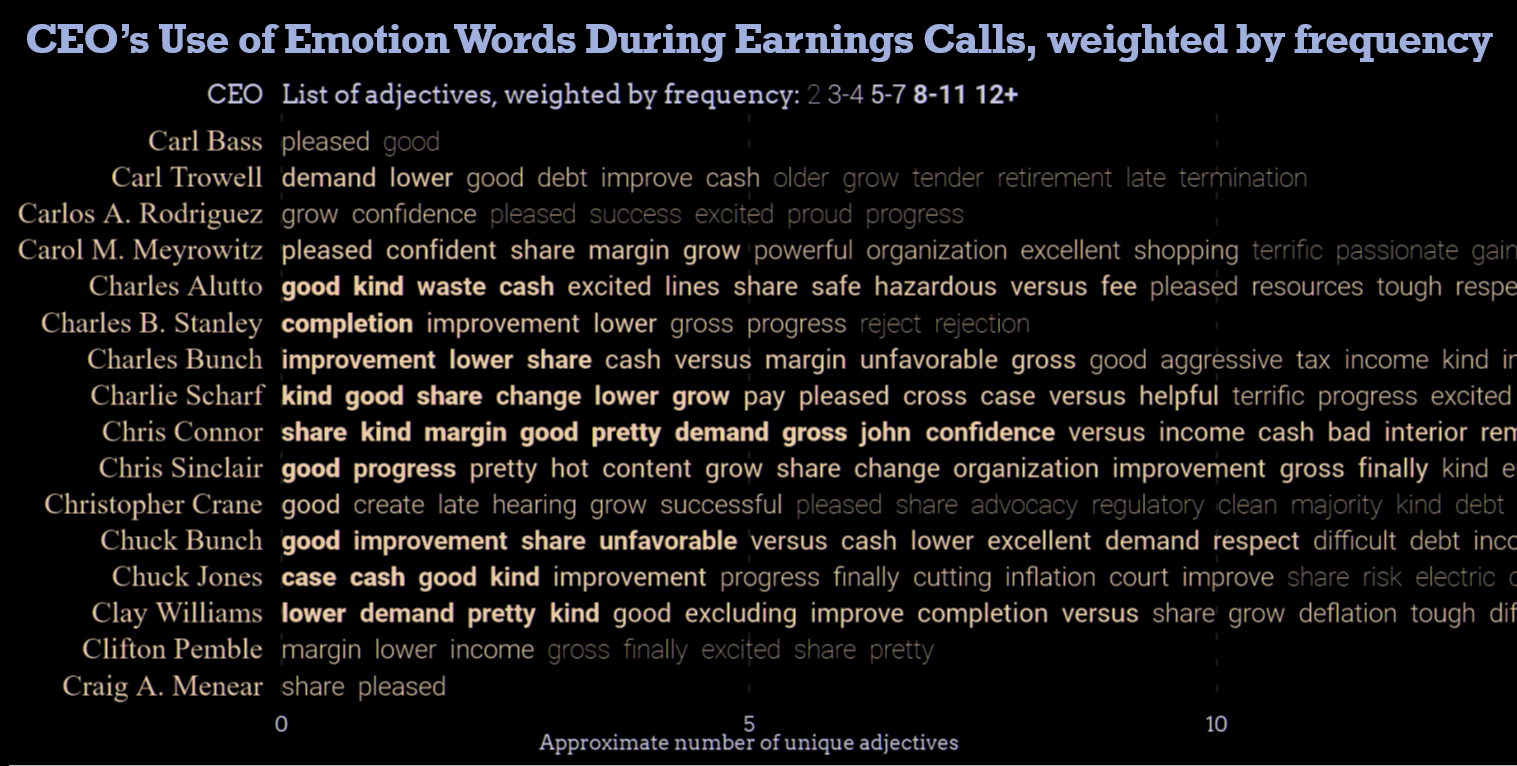
Repeated words (good, improvement, pleased) show the similarity of earnings calls across industries.
To gain more insight, we applied term frequency-inverse document frequency (TFIDF) to capture words that are unique to each CEO. Repopulating the chart, we see that these results better characterize the companies that each executive leads. For example, David Hallal was notable for his use of terms such as disease, devastating and therapeutic. Cross-referencing him online, we can see that Hallal was CEO of Alexion Pharmaceuticals at the time of this call.
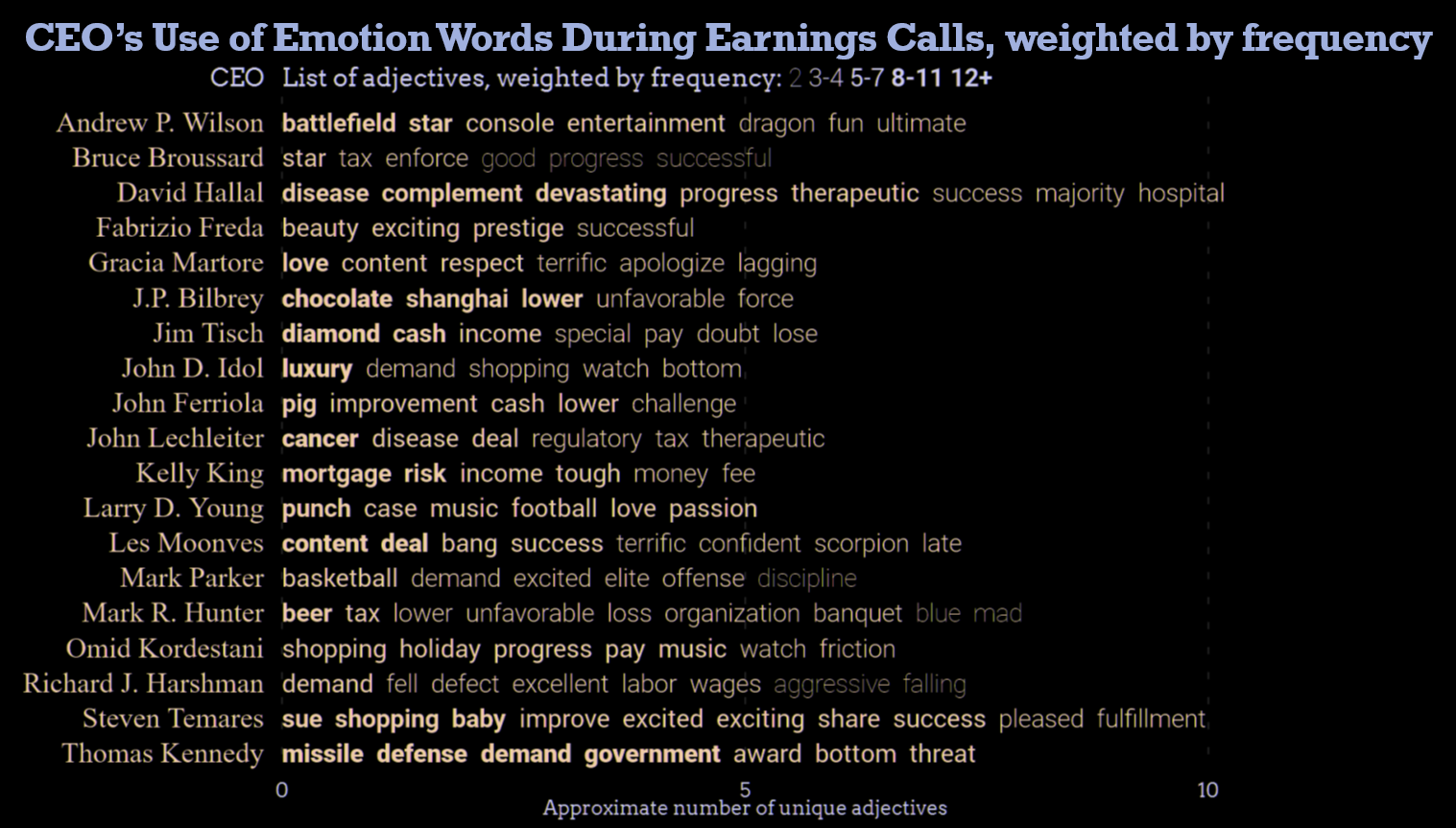
Unique emotion words highlight the differences between CEOs across many industries. Industry-specific vocabularies are clearer.
Extending this concept, we could potentially discover trends within or across business sectors by looking for underlying causes associated with negative words. For example, we might want to understand if weather, Internet competition, or trade issues were common themes discussed by different companies.
Litigious patent spaces
U.S. patent applications are an indicator of emergent innovation. But significant litigation in different areas of intellectual property can warrant caution. These signals can also guide U.S. Patent Office reviewer recruitment strategies and inform scrutiny of contentious patent areas.
We wanted to highlight these indicators in a massive collection of all U.S. patents issued since 1982. Because every application cites earlier patents, the citations serve as connections. This node (patents) and link (citations) representation lends itself to a visual analytic approach supported by our Salt library and patent-pending Graph Mapping methodology.
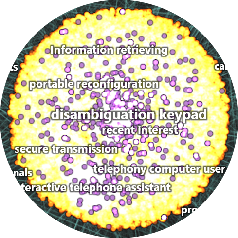
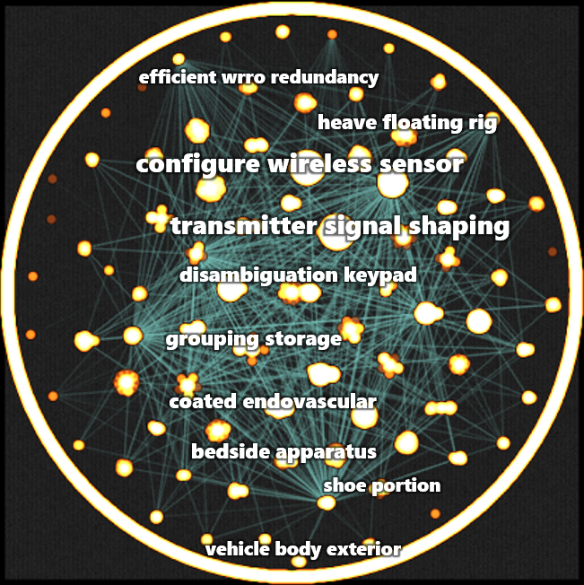
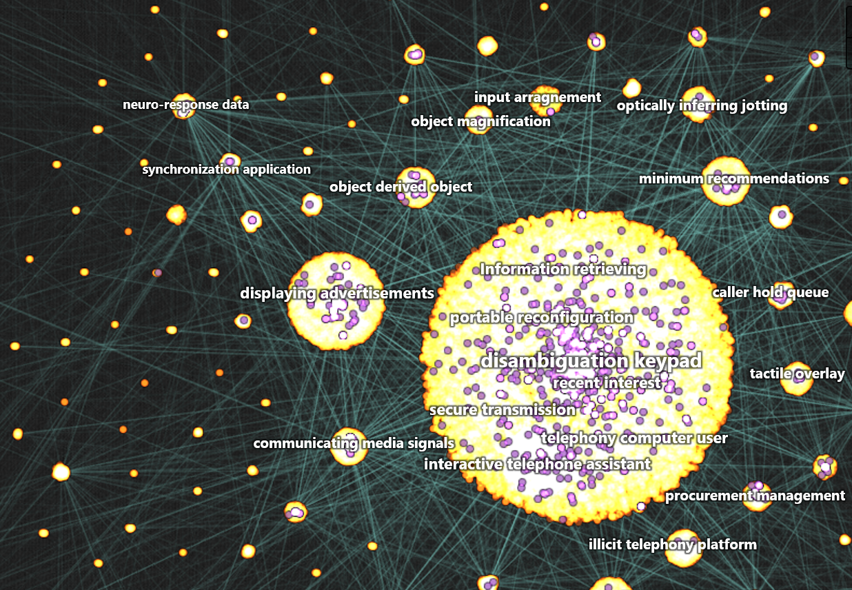
The result is an interactive hierarchical community graph. In this example, patents are orange dots and the links between them are semi-transparent blue lines. The graph draws highly interconnected patents near each other, grouping them into visible communities. Distinct labels for each community are extracted using NLP and TFIDF on the most cited patent. These provide a glimpse into the subject of the related patented technologies. Familiar pan-and-zoom controls allow navigation of the hierarchical graph at numerous resolutions.
Tightly plotted top-level communities revealed by plotting connections in U.S. patent data. Extracted labels suggest the technology space of each community (for example, telephony IP may be represented by disambiguation keypad).
A separate layer highlights litigated patents in purple. The disambiguation keypad community, for example, appears to have a high occurrence of litigation. But how can we visualize the frequency and ratio of litigated patents?
Zooming in several levels reveals related subcommunities. Litigation within the disambiguation keypad community appears prevalent, but what is the actual frequency?
Our approach applies oblique text effects to the community labels. Steep italics represent high litigation, while reverse italics represent low litigation. The disambiguation keypad label has the steepest angle of the visible communities, indicating that careful research should be applied when entering this space.
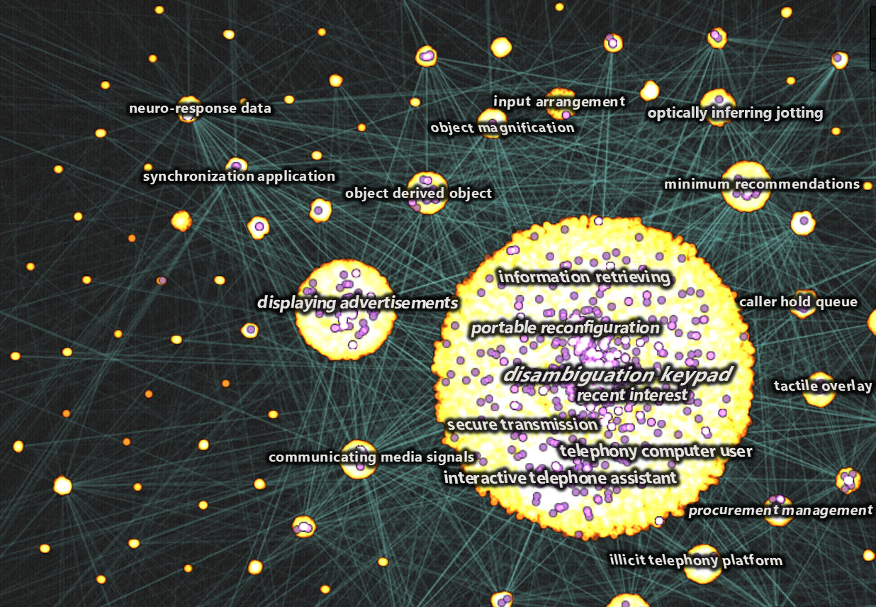
Varying levels of litigious patent spaces from high (disambiguation keypad) to low (secure transmission)
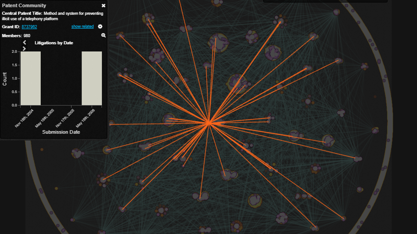
Additional interactions support further investigation into litigation activity. Clicking a label retrieves aggregate statistics for all the patents in a community. Users can also highlight all the communities to which a patent is connected or retrieve the patent publication itself.
The future of text analytics and visualization
Visualization isn’t just about numbers. Text repositories are typically several times larger than repositories of structured data; understanding their contents is just as important as numeric reports. A broad research space of text analytics now exists to parse individual letters or words or even whole paragraphs and documents.
Modern visualization libraries can integrate these analytics (e.g., tone characterization, proximity analysis, entity recognition and tagging) into visualizations for real-world applications. For example, text analytics on external communications could identify customer perceptions of your organization, propagation and stickiness of marketing messages or events in social signals that shift conversations. The path to new, meaningful business insights is readily available with open source technologies like Salt.
Watch Video: Strata 2017: Text Analytics and New Visualization Techniques